Please place votes here for the various designs of possible Square Enix Independent Wiki Alliance logos to be considered by the community. One vote per user, and please sign with a number-bullet signature below the triple line. Additional designs to be submitted should be posted on the main forum.
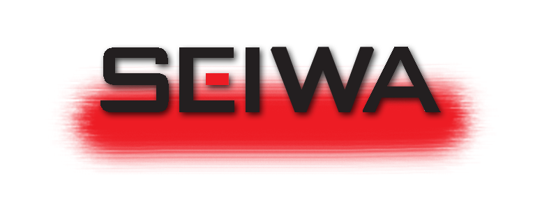
Logo 1
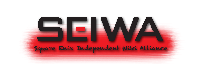
Logo 2
- AlVan 15:53, 26 April 2011 (EDT)AlVan
Logo 3
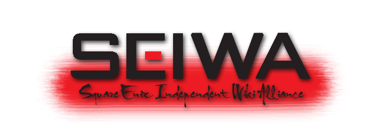
- Only problem I see is that "Enix" is a little hard to read. --
 LegoAlchemist 17:32, 23 April 2011 (EDT)
- I vote for it. Looks cool to me.--My Keyblade + Your face = pwnage 18:47, 23 April 2011 (EDT)Chihuahuaman
- Mechy LIKES this logo!--
 Mechajin I fight for my friends!
- I like the japanese-art font. :) --Bud0011 15:51, 26 April 2011 (EDT).
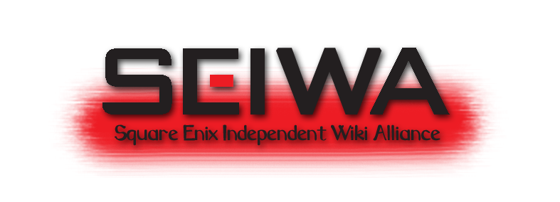
Logo 4
- --DTN
 16:23, 23 April 2011 (EDT)
- --Lukethehedgehog 16:25, 23 April 2011 (EDT)
- --Ag (Silver) - 47 107.8682 amu ~Crono
 16:28, 23 April 2011 (EDT)
- --Erry
 16:30, 23 April 2011 (EDT)
- --
 Dan - Don't Blink! ♫
  16:30, 23 April 2011 (EDT)
- --Didn't see this one o.o Chitalian8 16:35, 23 April 2011 (EDT)
- --Not too childish, but not too stylized. My favorite. --File:Xigbar - Replica Data.pngAS IF!File:Xigbar - Replica Data.png 16:35, 23 April 2011 (EDT)
- --I'm torn between number 1 and number 4 in terms of design, but this works best to explain what SEIWA is, particularly to those who come across us for the first time. TamboursNéant Ensemble ! 19:52, 23 April 2011 (EDT)
- --Xion4ever 20:00, 23 April 2011 (EDT)
- --LapisLazuliScarab21:20, 23 April 2011 (EDT)
- Neumannz, The Dark Falcon 21:52, 23 April 2011 (EDT)
- The17
 Master 22:37, 23 April 2011 (EDT)
- UxieLover1994 00:48, 24 April 2011 (EDT)
- --Simple, official, and easy to read. Light
 Roxas 13:05, 24 April 2011 (EDT)
- 1. Too simple. 2. Too nice. 3. Too dangerous. 4. Just right!
 I never said most of the things I've said 20:09, 24 April 2011 (EDT)
 Keyblade0
- --Bit simple, but I think I like it better then 2 (3 is just too much, sorry). FT 19:36, 28 April 2011 (EDT)
 Darkheart3
 Organization13
  06:17, 1 May 2011 (EDT)
Discussion

|
|
|
|
|
|
|
|
|
|
|
|
|
|
|
|
|
|
|
|
|
|
|
|
|
|
|
|
|
|
|
|
|
|
|
|
|
|
|
|
 AS IF! The world is garbage! CRUNCH! AS IF! The world is garbage! CRUNCH!
|
|
|
|
|
|
|
|
|
|
|
|
|
|
|
|
|
|
|
|
|
|
|
|
|
|
|
|
|
|
|
|
|
|
|
|
|
|
|
|
|
|
|
|
|
I changed the second logo. The text is slightly higher and "Independent" is no longer misspelled. Place your vote accordingly.
|
|
|
|
|
|
|
|
|
|
|
|
|
|
|
|
|
|
|
|
|
|
|
|
|

|
|
|
|
|
|
|
|
|
|
|
|
|
|
|
|
|
|
|
|
|
|
|
|
|
|
|
|
|
|
|
|
|
|
|
|
|
|
|
|
Chitalian8 Say... — Only by allowing strangers in can we find new ways to be ourselves. Life's little crossroads are often as simple as the pull of a trigger. — 21:59, 23 April 2011 (EDT)
|
|
|
|
|
|
|
|
|
|
|
|
|
|
|
|
|
|
|
|
|
|
|
|
|
|
|
|
|
|
|
|
|
|
|
|
|
|
|
|
|
|
|
|
|
 Maybe for Logo 1, you shouldn't have that empty red space below the text, it seems like something was supposed to be put there. Maybe for Logo 1, you shouldn't have that empty red space below the text, it seems like something was supposed to be put there.
|
|
|
|
|
|
|
|
|
|
|
|
|
|
|
|
|
|
|
|
|
|
|
|
|
|
|
|
|
|
|
|
|
|
|
|
|
|
|
|
|
|
|
|
|
|
|
|
|
|
|
|
|
|
|
|
|
|
|
|
|
|
|
|
|
AlVan - I'm the leading man, you know.
TALK - {{{time}}}
|
|
|
|
|
|
|
|
|
|
|
|
|
|
|
|
|
|
|
|
|
|
|
|
|
|
|
|
|
|
|
|
|
|
|
|
|
|
|
|
|
|
|
|
|
As far as I'm concerned, 2 is the perfect balance between them
|
|
|
|
|
|
|
|
|
|
|
|
|
|
|
|
|
|
|
|
|
|
|
|
|
