|
|
| Line 181: |
Line 181: |
| {{EO|time=01:28, 2 February 2012 (UTC)|thinking=Meh, I prefer the first one because of the rounded edges, of all things. Remember, Soxra...just because a template looked good on the Keyhole, it doesn't necessarily mean it will still work the way it did here.}} | | {{EO|time=01:28, 2 February 2012 (UTC)|thinking=Meh, I prefer the first one because of the rounded edges, of all things. Remember, Soxra...just because a template looked good on the Keyhole, it doesn't necessarily mean it will still work the way it did here.}} |
| Templates that worked in the keyhole should work even better in an independent wiki when there are no limitations or restrictions by wikia, in all honesty.--{{User:Dark-EnigmaXIII/Sig}} 02:07, 2 February 2012 (UTC) | | Templates that worked in the keyhole should work even better in an independent wiki when there are no limitations or restrictions by wikia, in all honesty.--{{User:Dark-EnigmaXIII/Sig}} 02:07, 2 February 2012 (UTC) |
| | {{LA|Vtext=I agree with ENX; I don't like the Keyhole's templates for this one, [http://kingdomhearts.wikia.com/wiki/Mysterious_Figure <font color=purple>especially when they all pile up</font>]. The old one just looks... cleaner.}} |
Revision as of 04:40, 2 February 2012
Okay, so I created this forum for us, mostly (but not limited to) me and Soxra, to suggest aesthetic changes to the content of this wiki. So, if you have suggestions, feel free to share them here, and please, follow the format.
Thumbnails Frames [implemented]

|
|
|
EVA Unit XIII - The beginning and the end share the same moment.
TALK - I've been waiting for this moment... 04:41, 30 January 2012 (UTC)
|
|
|
|
|
|
|
|
|
|
|
|
|
|
|
|
|
|
|
|
|
|
|
|
|
|
|
|
|
|
|
|
Browsing our articles, I realized that the images to further ilustrates subjects and situations in the story sections and the others... didnt really catch the eye, and as such, they didnt really illustrate the subjects. Besides, they are plain boring, so I think a nice, color frame around them will make them look more appealing to the eye. Below are some examples:
- No frame (Current)

- Frame (My suggestion)

Note that the color used can be freely customized so it's not bound to be that shade of blue I have in my custom .css. What do you guys think?
|
|
|
|
|
Discussion

|
|
|
|
|
|
|
|
|
|
|
|
|
|
|
|
|
|
|
|
|
|
|
|
|
|
|
|
|
|
|
|
|
|
|
|
|
|
|
|
UxieLover1994 Nya? — 09:06, 30 January 2012 (UTC)
|
|
|
|
|
|
|
|
|
|
|
|
|
|
|
|
|
|
|
|
|
|
|
|
|
|
|
|
|
|
|
|
|
|
|
|
|
|
|
|
|
|
|
|
|
 (Like my new box? Hikari made it for me) Well, if Bulbapedia can change colors for boxes and such, many wikis can, including us. (Like my new box? Hikari made it for me) Well, if Bulbapedia can change colors for boxes and such, many wikis can, including us.
|
|
|
|
|
|
|
|
|
|
|
|
|
|
|
|
|
|
|
|
|
|
|
|
|

|
|
|
|
|
|
|
|
|
|
|
|
|
|
|
|
|
|
|
|
|
|
|
|
|
|
|
|
|
|
|
|
|
|
|
|
|
|
|
|
ShardofTruth Once you believe, truth and lie are quite the same thing. — 14:56, 30 January 2012 (UTC)
|
|
|
|
|
|
|
|
|
|
|
|
|
|
|
|
|
|
|
|
|
|
|
|
|
|
|
|
|
|
|
|
|
|
|
|
|
|
|
|
|
|
|
|
|
 I like it, especially the curves. Maybe we could adjust the color to the new design (and by that I don't mean pink). I like it, especially the curves. Maybe we could adjust the color to the new design (and by that I don't mean pink).
|
|
|
|
|
|
|
|
|
|
|
|
|
|
|
|
|
|
|
|
|
|
|
|
|
|
|
|
|
|
|
|
|
|
|
|
|

|
|
|
|
|
|
|
|
|
|
|
|
|
|
|
|
|
|
|
|
|
|
|
|
|
|
|
|
|
|
|
|
|
|
|
|
|
|
|
|
17master - Wow, Phones! That was spesticular!
TALK - It's a party in my mouth! - 15:24, 30 January 2012 (UTC)
|
|
|
|
|
|
|
|
|
|
|
|
|
|
|
|
|
|
|
|
|
|
|
|
|
|
|
|
|
|
|
|
|
|
|
|
|
|
|
|
|
|
|
|
|
Oh gog rounded edge.
17 approves.
|
|
|
|
|
|
|
|
|
|
|
|
|
|
|
|
|
|
|
|
|
|
|
|
|

|
|
|
|
|
|
|
|
|
|
|
|
|
|
|
|
|
|
|
|
|
|
|
|
|
|
|
|
|
|
|
|
|
|
|
|
|
|
|
|
Pea14733 Haha, some folks just don't take no for an answer. — 17:22, 30 January 2012 (UTC)
|
|
|
|
|
|
|
|
|
|
|
|
|
|
|
|
|
|
|
|
|
|
|
|
|
|
|
|
|
|
|
|
|
|
|
|
|
|
|
|
|
|
|
|
|
Nice idea, DE. :D
|
|
|
|
|
|
|
|
|
|
|
|
|
|
|
|
|
|
|
|
|
|
|
|
|
|
|
|
|
|
|
|
|
|
|
|
|

|
|
|
|
|
|
|
|
|
|
|
|
|
|
|
|
|
|
|
|
|
|
|
|
|
|
|
|
|
|
|
|
|
|
|
|
|
|
|
|
ShadowsTwilight - He's leaving you behind, and when you catch up, he'll be a different person
TALK - HAHAHAHAHAHAHAHAHA
|
|
|
|
|
|
|
|
|
|
|
|
|
|
|
|
|
|
|
|
|
|
|
|
|
|
|
|
|
|
|
|
|
|
|
|
|
|
|
|
|
|
|
|
|
 I like it I like it
|
|
|
|
|
|
|
|
|
|
|
|
|
|
|
|
|
|
|
|
|
|
|
|
|

|
|
|
|
|
|
|
|
|
|
|
|
|
|
|
|
|
|
|
|
|
|
|
|
|
|
|
|
|
|
|
|
|
|
|
|
|
|
|
|
Chitalian8 Say... — Mother and Father call me Joshua. I guess you can call me Joshua, too... Since you're my dear, dear partner. I don't see how this is my fault. You're the one who refuses to call me Pink. — 21:06, 30 January 2012 (UTC)
|
|
|
|
|
|
|
|
|
|
|
|
|
|
|
|
|
|
|
|
|
|
|
|
|
|
|
|
|
|
|
|
|
|
|
|
|
|
|
|
|
|
|
|
|
 This frame, I like it. ANOTHER. This frame, I like it. ANOTHER.
|
|
|
|
|
|
|
|
|
|
|
|
|
|
|
|
|
|
|
|
|
|
|
|
|
Eh, I prefer the one we're currently using. The other would make it look less organized. But, I haven't seen it being used in any articles yet so I can't say for sure if it would look bad or not. Maybe it would look good, also depending on which color we would chose. But for now I'm still saying no this until I see it in action. - JTD95 21:56, 30 January 2012 (UTC)
- In response to your doubts, JTD95, no, the frames do not collide with the content and do not make it look chaotic, as you can see Here. Since the general consensus seem to be that this change is liked, all that remains is to decide in a color before I can apply it.--Dark-EnigmaXIII 22:22, 30 January 2012 (UTC)

|
|
|
|
|
|
|
|
|
|
|
|
|
|
|
|
|
|
|
|
|
|
|
|
|
|
|
|
|
|
|
|
|
|
|
|
|
|
|
|
Eternal Nothingness XIII -  You have to be strong. Strength of heart will carry you through the hardest of trials. You have to be strong. Strength of heart will carry you through the hardest of trials.
TALK - What I do, I do for friendship. — 22:52, 30 January 2012 (UTC)
|
|
|
|
|
|
|
|
|
|
|
|
|
|
|
|
|
|
|
|
|
|
|
|
|
|
|
|
|
|
|
|
|
|
|
|
|
|
|
|
|
|
|
|
|
 All for it! All for it!
|
|
|
|
|
|
|
|
|
|
|
|
|
|
|
|
|
|
|
|
|
|
|
|
|

|
|
|
|
|
|
|
|
|
|
|
|
|
|
|
|
|
|
|
|
|
|
|
|
|
|
|
|
|
|
|
|
|
|
|
|
|
|
|
|
UnknownChaser - You had potential at the academy. What a waste.... But I have no business with weaklings or puppets.
TALK - 00:27, 31 January 2012 (UTC)
|
|
|
|
|
|
|
|
|
|
|
|
|
|
|
|
|
|
|
|
|
|
|
|
|
|
|
|
|
|
|
|
|
|
|
|
|
|
|
|
|
|
|
|
|
 Aye, looks awesome, lets do it. Aye, looks awesome, lets do it.
|
|
|
|
|
|
|
|
|
|
|
|
|
|
|
|
|
|
|
|
|
|
|
|
|
|
|
|
|
|
|
|
|
|
|
|
|
|
|
|
|
|
|
|
|
|
|
|
|
|
|
|
|
|
|
|
|
|
|
|
|
|
|
|
|
Light_Roxas - "I'm a dwarf and I'm digging a hole! DIGGY DIGGY HOLE!!"
TALK - "I DEMAND YOUR FINEST BACON!"
|
|
|
|
|
|
|
|
|
|
|
|
|
|
|
|
|
|
|
|
|
|
|
|
|
|
|
|
|
|
|
|
|
|
|
|
|
|
|
|
|
|
|
|
|
I don't have a problem with the color you have there, to be honest. but orange is my favorite color...
|
|
|
|
|
|
|
|
|
|
|
|
|
|
|
|
|
|
|
|
|
|
|
|
|
|
|
|
|
|
|
|
|
|
|
|
|

|
|
|
|
|
|
|
|
|
|
|
|
|
|
|
|
|
|
|
|
|
|
|
|
|
|
|
|
|
|
|
|
|
|
|
|
|
|
|
|
SidVI - It's weird. I feel like I'm forgetting something really important.
TALK - Who am I going to have ice cream with? - 19:07, 1 February 2012 (UTC)
|
|
|
|
|
|
|
|
|
|
|
|
|
|
|
|
|
|
|
|
|
|
|
|
|
|
|
|
|
|
|
|
|
|
|
|
|
|
|
|
|
|
|
|
|
I like it, and since you can change the colours, it should be pretty damn good.
|
|
|
|
|
|
|
|
|
|
|
|
|
|
|
|
|
|
|
|
|
|
|
|
|
Category Bar + Input Buttons [implemented]
|
|
|
Soxra - You've heard of it, haven't you? The legend of Sparda?
Let's rock! - Soxxeh 04:50, 30 January 2012 (UTC)
|
|
|
|
|
|
|
|
|
|
|
|
|
|
|
|
|
|
|
|
|
|
|
|
|
|
|
|
|
|
|
|
On the same ideas as above, the category bar the bottom of each article, as well as the input buttons (such as "Go" and "Search") are rather flat and boring. (I group these together because the proposed style for both is rather similar.)
- Current (browser-dependent)

- Proposed

Again, keep in mind that we are not bound by color here. Any color can be used, I've just used grey for the sake of simplicity.
|
|
|
|
|
Discussion
|
|
|
|
|
|
|
|
|
|
|
|
|
|
|
|
|
|
|
|
|
|
|
|
|
|
|
|
|
|
|
|
|
|
|
|
|
|
|
|
|
ShardofTruth Once you believe, truth and lie are quite the same thing. — 14:56, 30 January 2012 (UTC)
|
|
|
|
|
|
|
|
|
|
|
|
|
|
|
|
|
|
|
|
|
|
|
|
|
|
|
|
|
|
|
|
|
|
|
|
|
|
|
|
|
|
|
|
|
This looks really good.
|
|
|
|
|
|
|
|
|
|
|
|
|
|
|
|
|
|
|
|
|
|
|
|
|
|
|
|
|
|
|
|
|
|
|
|
|
|
|
|
|
|
|
|
|
|
|
|
|
|
|
|
|
|
|
|
|
|
|
|
|
|
|
|
|
|
|
|
|
|
|
|
|
|
|
|
|
|
17master - Wow, Phones! That was spesticular!
TALK - It's a party in my mouth! - 15:24, 30 January 2012 (UTC)
|
|
|
|
|
|
|
|
|
|
|
|
|
|
|
|
|
|
|
|
|
|
|
|
|
|
|
|
|
|
|
|
|
|
|
|
|
|
|
|
|
|
|
|
|
Same as above, I really like these two ideas.
|
|
|
|
|
|
|
|
|
|
|
|
|
|
|
|
|
|
|
|
|
|
|
|
|
|
|
|
|
|
|
|
|
|
|
|
|
|
|
|
|
|
|
|
|
|
|
|
|
|
|
|
|
|
|
|
|
|
|
|
|
|
|
|
|
|
Pea14733 Haha, some folks just don't take no for an answer. — 17:25, 30 January 2012 (UTC)
|
|
|
|
|
|
|
|
|
|
|
|
|
|
|
|
|
|
|
|
|
|
|
|
|
|
|
|
|
|
|
|
|
|
|
|
|
|
|
|
|
|
|
|
|
These ideas are heavenly. :3
PS. Why should we have two discussion sections?
|
|
|
|
|
|
|
|
|
|
|
|
|
|
|
|
|
|
|
|
|
|
|
|
|
|
|
|
|
|
|
|
|
|
|
|
|
|
|
|
Soxra - This party's getting crazy! Let's rock!
It's showtime! - Soxxeh 17:31, 30 January 2012 (UTC)
|
|
|
|
|
|
|
|
|
|
|
|
|
|
|
|
|
|
|
|
|
|
|
|
|
|
|
|
|
|
|
|
The ideas will be posted one-after-another. These two are just a start, so every idea will have a separate discussion section.
|
|
|
|
|

|
|
|
|
|
|
|
|
|
|
|
|
|
|
|
|
|
|
|
|
|
|
|
|
|
|
|
|
|
|
|
|
|
|
|
|
|
|
|
|
maggosh The steel is forged... — "Souls as far as the eye can see..." "If you want light to rule over all, then you must rid the world of everything else."
|
|
|
|
|
|
|
|
|
|
|
|
|
|
|
|
|
|
|
|
|
|
|
|
|
|
|
|
|
|
|
|
|
|
|
|
|
|
|
|
|
|
|
|
|
I'm just gonna say I approve of both ideas. These will really help make the wiki more polished.
|
|
|
|
|
|
|
|
|
|
|
|
|
|
|
|
|
|
|
|
|
|
|
|
|
|
|
|
|
|
|
|
|
|
|
|
|
|
|
|
|
|
|
|
|
|
|
|
|
|
|
|
|
|
|
|
|
|
|
|
|
|
|
|
|
|
ShadowsTwilight - He's leaving you behind, and when you catch up, he'll be a different person
TALK - HAHAHAHAHAHAHAHAHA
|
|
|
|
|
|
|
|
|
|
|
|
|
|
|
|
|
|
|
|
|
|
|
|
|
|
|
|
|
|
|
|
|
|
|
|
|
|
|
|
|
|
|
|
|
stylish, i like it
|
|
|
|
|
|
|
|
|
|
|
|
|
|
|
|
|
|
|
|
|
|
|
|
|
|
|
|
|
|
|
|
|
|
|
|
|
|
|
|
|
|
|
|
|
|
|
|
|
|
|
|
|
|
|
|
|
|
|
|
|
|
|
|
|
|
Light_Roxas - "I'm a dwarf and I'm digging a hole! DIGGY DIGGY HOLE!!"
TALK - "I DEMAND YOUR FINEST BACON!"
|
|
|
|
|
|
|
|
|
|
|
|
|
|
|
|
|
|
|
|
|
|
|
|
|
|
|
|
|
|
|
|
|
|
|
|
|
|
|
|
|
|
|
|
|
Me gusta! These are fantastic ideas and only help me be further thankful we've got you two working for us!
|
|
|
|
|
|
|
|
|
|
|
|
|
|
|
|
|
|
|
|
|
|
|
|
|
|
|
|
|
|
|
|
|
|
|
|
|
|
|
|
|
|
|
|
|
|
|
|
|
|
|
|
|
|
|
|
|
|
|
|
|
|
|
|
|
|
|
|
|
|
|
|
|
|
|
|
|
|
Eternal Nothingness XIII - You have to be strong. Strength of heart will carry you through the hardest of trials.
TALK - What I do, I do for friendship. — 22:53, 30 January 2012 (UTC)
|
|
|
|
|
|
|
|
|
|
|
|
|
|
|
|
|
|
|
|
|
|
|
|
|
|
|
|
|
|
|
|
|
|
|
|
|
|
|
|
|
|
|
|
|
Fail to see why everything needs to have a rounded edge...categories don't need to look flashy...it's the contents of the article that are important.
|
|
|
|
|
|
|
|
|
|
|
|
|
|
|
|
|
|
|
|
|
|
|
|
|
|
|
|
|
Soxra - This party's getting crazy! Let's rock!
It's showtime! - Soxxeh 23:54, 30 January 2012 (UTC)
|
|
|
|
|
|
|
|
|
|
|
|
|
|
|
|
|
|
|
|
|
|
|
|
|
|
|
|
|
|
|
|
@ENX: If you want to attract all varieties of users, it has to look visually appealing. That's a given.
@As If: That's because the CSS you're using is my personal CSS. It uses fonts of mine, images of mine, etc. Don't expect the full experience.
|
|
|
|
|
|
|
|
|
|
|
|
|
|
|
|
|
|
|
|
|
|
|
|
|
|
|
|
|
|
|
|
|
|
|
|
|
|
|
|
|
|
|
|
|
|
UnknownChaser - You had potential at the academy. What a waste.... But I have no business with weaklings or puppets.
TALK - 00:27, 31 January 2012 (UTC)
|
|
|
|
|
|
|
|
|
|
|
|
|
|
|
|
|
|
|
|
|
|
|
|
|
|
|
|
|
|
|
|
|
|
|
|
|
|
|
|
|
|
|
|
|
Aye, looks awesome I'm all for it. But why no triangle edges? What type of triangles discrimination is this?
|
|
|
|
|
|
|
|
|
|
|
|
|
|
|
|
|
|
|
|
|
|
|
|
|

|
|
|
|
|
|
|
|
|
|
|
|
|
|
|
|
|
|
|
|
|
|
|
|
|
|
|
|
|
|
|
|
|
|
|
|
|
|
|
|
LegoAlchemist - They changed "Snipe Magnet" to "Magnet Grab"? Who's translating this game, 4kids?
TALK - Friendships are in direct contravention of mercenary conduct as delineated in your contracts, and on a personal note: I am very, very, disappointed with you.
|
|
|
|
|
|
|
|
|
|
|
|
|
|
|
|
|
|
|
|
|
|
|
|
|
|
|
|
|
|
|
|
|
|
|
|
|
|
|
|
|
|
|
|
|
 These actually look amazing. I think the default gallery box color should be dark purple, to match our theme. These actually look amazing. I think the default gallery box color should be dark purple, to match our theme.
|
|
|
|
|
|
|
|
|
|
|
|
|
|
|
|
|
|
|
|
|
|
|
|
|
|
|
|
|
|
|
|
|
|
|
|
|
|
|
|
|
|
|
|
|
|
|
|
|
|
|
|
|
|
|
|
|
|
|
|
|
|
|
|
|
|
SidVI - It's weird. I feel like I'm forgetting something really important.
TALK - Who am I going to have ice cream with? - 19:07, 1 February 2012 (UTC)
|
|
|
|
|
|
|
|
|
|
|
|
|
|
|
|
|
|
|
|
|
|
|
|
|
|
|
|
|
|
|
|
|
|
|
|
|
|
|
|
|
|
|
|
|
I like it, because it's clearer and more appealing.
|
|
|
|
|
|
|
|
|
|
|
|
|
|
|
|
|
|
|
|
|
|
|
|
|
SEIWA Template
|
|
|
|
|
|
|
|
|
|
|
|
|
|
|
|
|
|
|
|
|
|
|
|
|
|
|
|
|
|
|
|
|
|
|
|
|
|
|
|
|
maggosh The steel is forged... — "Souls as far as the eye can see..." "If you want light to rule over all, then you must rid the world of everything else."
|
|
|
|
|
|
|
|
|
|
|
|
|
|
|
|
|
|
|
|
|
|
|
|
|
|
|
|
|
|
|
|
|
|
|
|
|
|
|
|
|
|
|
|
|
An idea I came up with and emulated from the Valve Wiki Network template. Erry assisted me in its aesthetics.
- Current
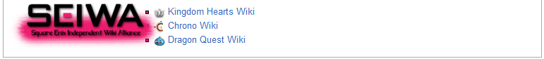
- Proposed

|
|
|
|
|
|
|
|
|
|
|
|
|
|
|
|
|
|
|
|
|
|
|
|
|
Discussion
|
|
|
|
|
|
|
|
|
|
|
|
|
|
|
|
|
|
|
|
|
|
|
|
|
|
|
|
|
|
|
|
|
|
|
|
|
|
|
|
|
SidVI - It's weird. I feel like I'm forgetting something really important.
TALK - Who am I going to have ice cream with? - 19:07, 1 February 2012 (UTC)
|
|
|
|
|
|
|
|
|
|
|
|
|
|
|
|
|
|
|
|
|
|
|
|
|
|
|
|
|
|
|
|
|
|
|
|
|
|
|
|
|
|
|
|
|
I like it, it's a really good idea, but where would this template go (on the main page, where, I mean)
|
|
|
|
|
|
|
|
|
|
|
|
|
|
|
|
|
|
|
|
|
|
|
|
|
I personally think in its current state at the very bottom, rather than a window You have wormed your way to the very nadir of repugnance. - Erry 19:22, 1 February 2012 (UTC)

|
|
|
|
Neumannz — Looks like I'm gonna have to jump...!
TALK — I work alone! Except when I work with Xion...which is all the time.— 20:16, 1 February 2012 (UTC)
|
|
|
|
|
|
|
|
|
|
|
|
|
|
| The Chrono Wiki logo needs to stand out more from the background. Maybe a white highlight border?
|
|
|
|

|
|
|
|
|
|
|
|
|
|
|
|
|
|
|
|
|
|
|
|
|
|
|
|
|
|
|
|
|
|
|
|
|
|
|
|
|
|
|
|
Eternal Nothingness XIII - Funny... This whole time, I've been telling myself I want to be stronger, more independent... But the second I let my heart do the talking... I find out how little I really know myself. And how much I miss them.
TALK - All this time, I've been staring into the darkness... But... that doesn't mean I have to jump in. — 01:08, 2 February 2012 (UTC)
|
|
|
|
|
|
|
|
|
|
|
|
|
|
|
|
|
|
|
|
|
|
|
|
|
|
|
|
|
|
|
|
|
|
|
|
|
|
|
|
|
|
|
|
|
Looks good, but the tops of the letters in "SEIWA" get lost against the background, and in my personal opinion, the text underneath the SEIWA logo is a tad hard to see. Other than that, looks great!
|
|
|
|
|
|
|
|
|
|
|
|
|
|
|
|
|
|
|
|
|
|
|
|
|
Nav Bars
|
|
|
|
Soxra - You've heard of it, haven't you? The legend of Sparda?
Let's rock! - Soxxeh 21:06, 1 February 2012 (UTC)
|
|
|
|
|
|
|
|
|
|
|
|
|
|
|
|
|
|
|
|
|
|
|
|
|
|
|
|
|
|
|
|
The navigation bars, however consistent they are, use outdated and squared formatting which do not go with the rest of the site. Additionally, their current formatting only displays correctly for Firefox users. A new look will brighten the footer of the article and let users enjoy the transitions between pages.
- Old
- [1]
- New
- [2]
|
|
|
|
|
Discussion
|
|
|
|
|
|
|
|
|
|
|
|
|
|
|
|
|
|
|
|
|
|
|
|
|
|
|
|
|
|
|
|
|
|
|
|
|
|
|
|
|
Eternal Nothingness XIII - Funny... This whole time, I've been telling myself I want to be stronger, more independent... But the second I let my heart do the talking... I find out how little I really know myself. And how much I miss them.
TALK - All this time, I've been staring into the darkness... But... that doesn't mean I have to jump in. — 01:13, 2 February 2012 (UTC)
|
|
|
|
|
|
|
|
|
|
|
|
|
|
|
|
|
|
|
|
|
|
|
|
|
|
|
|
|
|
|
|
|
|
|
|
|
|
|
|
|
|
|
|
|
The rounded edges are growing on me...but I still think the templates themselves are tad bit "boring" to look at. Any way they can be "jazzed up" without totally ruining their purpose/formatting? Could they possibly look more Kingdom Hearts-y?
|
|
|
|
|
|
|
|
|
|
|
|
|
|
|
|
|
|
|
|
|
|
|
|
|
|
|
|
|
Soxra - You've heard of it, haven't you? The legend of Sparda?
Let's rock! - Soxxeh 21:06, 1 February 2012 (UTC)
|
|
|
|
|
|
|
|
|
|
|
|
|
|
|
|
|
|
|
|
|
|
|
|
|
|
|
|
|
|
|
|
The header templates are nicely colored and have good images, but could be more representative of what they signify: attention-getters. In order to get the most people to contribute to the articles, they not only have to be aware that changes are required, but what they should be changing. Colorful and list-oriented templates will help with this.
- Old
- [3]
- New
- [4]
|
|
|
|
|
Discussion
|
|
|
|
|
|
|
|
|
|
|
|
|
|
|
|
|
|
|
|
|
|
|
|
|
|
|
|
|
|
|
|
|
|
|
|
|
|
|
|
|
Eternal Nothingness XIII - Funny... This whole time, I've been telling myself I want to be stronger, more independent... But the second I let my heart do the talking... I find out how little I really know myself. And how much I miss them.
TALK - All this time, I've been staring into the darkness... But... that doesn't mean I have to jump in. — 01:09, 2 February 2012 (UTC)
|
|
|
|
|
|
|
|
|
|
|
|
|
|
|
|
|
|
|
|
|
|
|
|
|
|
|
|
|
|
|
|
|
|
|
|
|
|
|
|
|
|
|
|
|
Interesting...good work on these, Soxra! However, I am NOT a fan of using such tiny images (I understand they are larger images resized to fit the template). It should be the talk bubble images or nothing in my opinion.
|
|
|
|
|
|
|
|
|
|
|
|
|
|
|
|
|
|
|
|
|
|
|
|
|
|
|
|
|
|
|
|
|
|
|
|
|
|
|
|
|
|
|
|
|
|
|
|
|
|
|
|
|
|
|
|
|
|
|
|
|
|
|
|
|
|
ShadowsTwilight - He's leaving you behind, and when you catch up, he'll be a different person
TALK - HAHAHAHAHAHAHAHAHA
|
|
|
|
|
|
|
|
|
|
|
|
|
|
|
|
|
|
|
|
|
|
|
|
|
|
|
|
|
|
|
|
|
|
|
|
|
|
|
|
|
|
|
|
|
Very nice, it seems very updated, i like
|
|
|
|
|
|
|
|
|
|
|
|
|
|
|
|
|
|
|
|
|
|
|
|
|
@ENX: Of course not. We used those tiny images in the keyhole in order not to imitate the talk bubble sprite idea that it was beign used here. The image this time can be whatever you guys want.--Dark-EnigmaXIII 02:03, 2 February 2012 (UTC)
Infoboxes
|
|
|
|
Soxra - You've heard of it, haven't you? The legend of Sparda?
Let's rock! - Soxxeh 21:06, 1 February 2012 (UTC)
|
|
|
|
|
|
|
|
|
|
|
|
|
|
|
|
|
|
|
|
|
|
|
|
|
|
|
|
|
|
|
|
The infoboxes are very well functional but full of code that bogs down the loading of pages and they look a bit widened and bulky at times. To trim them down, we can slim the size, padding, and adjust the colors of the templates to be more pleasing without losing functionality.
- Old
- [5]
- New
- [6]
|
|
|
|
|
Discussion
|
|
|
|
|
|
|
|
|
|
|
|
|
|
|
|
|
|
|
|
|
|
|
|
|
|
|
|
|
|
|
|
|
|
|
|
|
|
|
|
|
Eternal Nothingness XIII - Funny... This whole time, I've been telling myself I want to be stronger, more independent... But the second I let my heart do the talking... I find out how little I really know myself. And how much I miss them.
TALK - All this time, I've been staring into the darkness... But... that doesn't mean I have to jump in. — 01:14, 2 February 2012 (UTC)
|
|
|
|
|
|
|
|
|
|
|
|
|
|
|
|
|
|
|
|
|
|
|
|
|
|
|
|
|
|
|
|
|
|
|
|
|
|
|
|
|
|
|
|
|
Nothing much to say about this one...I'm all for it, but I'm not sure I'm a huge fan of the black-on-green.
|
|
|
|
|
|
|
|
|
|
|
|
|
|
|
|
|
|
|
|
|
|
|
|
|

|
|
|
|
|
|
|
|
|
|
|
|
|
|
|
|
|
|
|
|
|
|
|
|
|
|
|
|
|
|
|
|
|
|
|
|
|
|
|
|
 AS IF! The world is garbage! CRUNCH! AS IF! The world is garbage! CRUNCH!
|
|
|
|
|
|
|
|
|
|
|
|
|
|
|
|
|
|
|
|
|
|
|
|
|
|
|
|
|
|
|
|
|
|
|
|
|
|
|
|
|
|
|
|
|
Yes, definitely do this! Though I like the songs being under one tab better than in individual ones, though that may be just me.
|
|
|
|
|
|
|
|
|
|
|
|
|
|
|
|
|
|
|
|
|
|
|
|
|

|
|
|
|
|
|
|
|
|
|
|
|
|
|
|
|
|
|
|
|
|
|
|
|
|
|
|
|
|
|
|
|
|
|
|
|
|
|
|
|
Chitalian8 Say... — And here's me, playing the world's tiniest violin. Your face is priceless. — 03:36, 2 February 2012 (UTC)
|
|
|
|
|
|
|
|
|
|
|
|
|
|
|
|
|
|
|
|
|
|
|
|
|
|
|
|
|
|
|
|
|
|
|
|
|
|
|
|
|
|
|
|
|
IMHO, I like that the songs are under different tabs, seems more organized to me.
|
|
|
|
|
|
|
|
|
|
|
|
|
|
|
|
|
|
|
|
|
|
|
|
|
Quotes
|
|
|
|
Soxra - You've heard of it, haven't you? The legend of Sparda?
Let's rock! - Soxxeh 21:06, 1 February 2012 (UTC)
|
|
|
|
|
|
|
|
|
|
|
|
|
|
|
|
|
|
|
|
|
|
|
|
|
|
|
|
|
|
|
|
This is a minor change; it simply helps draw the eye to the quote and makes it stand out from the rest of the text.
- Old
- [7]
- New
- [8]
|
|
|
|
|
Discussion

|
|
|
|
|
|
|
|
|
|
|
|
|
|
|
|
|
|
|
|
|
|
|
|
|
|
|
|
|
|
|
|
|
|
|
|
|
|
|
|
AS IF! The world is garbage! CRUNCH!
|
|
|
|
|
|
|
|
|
|
|
|
|
|
|
|
|
|
|
|
|
|
|
|
|
|
|
|
|
|
|
|
|
|
|
|
|
|
|
|
|
|
|
|
|
Please, no. I really don't like this aesthetically. Yes, it does bring more focus to the quotes. However, I feel it looks quite tacky and unprofessional, regardless of how many other wikis use a similar template. I would rather you increased the size and color of the entire quote, rather than just the quotation marks. That would make it look less awkward.
|
|
|
|
|
|
|
|
|
|
|
|
|
|
|
|
|
|
|
|
|
|
|
|
|
|
|
|
|
|
|
|
|
|
|
|
|
|
|
|
|
|
|
|
|
|
|
|
|
|
|
|
|
|
|
|
|
|
|
|
|
|
|
|
|
|
Eternal Nothingness XIII - Funny... This whole time, I've been telling myself I want to be stronger, more independent... But the second I let my heart do the talking... I find out how little I really know myself. And how much I miss them.
TALK - All this time, I've been staring into the darkness... But... that doesn't mean I have to jump in. — 01:18, 2 February 2012 (UTC)
|
|
|
|
|
|
|
|
|
|
|
|
|
|
|
|
|
|
|
|
|
|
|
|
|
|
|
|
|
|
|
|
|
|
|
|
|
|
|
|
|
|
|
|
|
As it was just said, no, no, no, no, NO! Looks bloody awful to me. I personally find quotes are formatted just fine the way they are now and that they should not be changed...they are not what matter on an article to begin with (besides, we have the quotes pages to feature quotes now...no need to make an eyesore such as this appear in the main articles).
|
|
|
|
|
|
|
|
|
|
|
|
|
|
|
|
|
|
|
|
|
|
|
|
|
- Actually, guys, this would work really well here, since there's no width restriction as there was back in wikia. But, oh, well, let's hear other's opinion, too.--Dark-EnigmaXIII 02:06, 2 February 2012 (UTC)
Staff Member Template
|
|
|
|
Soxra - You've heard of it, haven't you? The legend of Sparda?
Let's rock! - Soxxeh 21:06, 1 February 2012 (UTC)
|
|
|
|
|
|
|
|
|
|
|
|
|
|
|
|
|
|
|
|
|
|
|
|
|
|
|
|
|
|
|
|
Another small change, the little key that signifies a staff member isn't too bold; if we were to use different-colored crowns to represent staff instead, it would give their positions a more rewarding sheen.
- Old
- [9]
- New
- [10]
|
|
|
|
|
Discussion
|
|
|
|
|
|
|
|
|
|
|
|
|
|
|
|
|
|
|
|
|
|
|
|
|
|
|
|
|
|
|
|
|
|
|
|
|
|
|
|
|
Eternal Nothingness XIII - Funny... This whole time, I've been telling myself I want to be stronger, more independent... But the second I let my heart do the talking... I find out how little I really know myself. And how much I miss them.
TALK - All this time, I've been staring into the darkness... But... that doesn't mean I have to jump in. — 01:21, 2 February 2012 (UTC)
|
|
|
|
|
|
|
|
|
|
|
|
|
|
|
|
|
|
|
|
|
|
|
|
|
|
|
|
|
|
|
|
|
|
|
|
|
|
|
|
|
|
|
|
|
Not really a big fan of this one. It's sort of the reason why we never used Xemnas back when there were enough staffers for an Org. XIII theme...we don't want to suggest superiority and minority. Having a user say "Oh, he's only a silver crown, so he's probably worthless, whereas this guy has a gold one and is probably the ultimate existence on this Wiki" is not what we want here. At least there's a level of common ground between the staff by using the same template.
|
|
|
|
|
|
|
|
|
|
|
|
|
|
|
|
|
|
|
|
|
|
|
|
|
- The point for this at the Keyhole was mostly so it was know what kind of activities a staffer could do, so users could know who to ask each thing, like moving pictures or blocking vandals. There's the staff page for that, but some users dont bother in checking the link at the bottom of the Interaction segment in the sidebar. By no means is this a way of showing superiority.--Dark-EnigmaXIII 02:01, 2 February 2012 (UTC)

|
|
|
|
|
|
|
|
|
|
|
|
|
|
|
|
|
|
|
|
|
|
|
|
|
|
|
|
|
|
|
|
|
|
|
|
|
|
|
|
Chitalian8 Say... — Only by allowing strangers in can we find new ways to be ourselves. Life's little crossroads are often as simple as the pull of a trigger. — 03:34, 2 February 2012 (UTC)
|
|
|
|
|
|
|
|
|
|
|
|
|
|
|
|
|
|
|
|
|
|
|
|
|
|
|
|
|
|
|
|
|
|
|
|
|
|
|
|
|
|
|
|
|
I like that this one differentiates between the Mods and the Admins, seems nice, don't really see too much of a problem with the "superiority" thing.
|
|
|
|
|
|
|
|
|
|
|
|
|
|
|
|
|
|
|
|
|
|
|
|
|
Utility Templates
|
|
|
|
Soxra - You've heard of it, haven't you? The legend of Sparda?
Let's rock! - Soxxeh 21:06, 1 February 2012 (UTC)
|
|
|
|
|
|
|
|
|
|
|
|
|
|
|
|
|
|
|
|
|
|
|
|
|
|
|
|
|
|
|
|
The utility templates, such as Template:Youmay, are a bit flowery and should be left-aligned. Using thick borders and dark colors helps draw the eye to its content and helps users find what they're looking for quickly and efficiently.
- Old
- [11]
- New
- [12]
|
|
|
|
|
Discussion
|
|
|
|
|
|
|
|
|
|
|
|
|
|
|
|
|
|
|
|
|
|
|
|
|
|
|
|
|
|
|
|
|
|
|
|
|
|
|
|
|
Eternal Nothingness XIII - Funny... This whole time, I've been telling myself I want to be stronger, more independent... But the second I let my heart do the talking... I find out how little I really know myself. And how much I miss them.
TALK - All this time, I've been staring into the darkness... But... that doesn't mean I have to jump in. — 01:28, 2 February 2012 (UTC)
|
|
|
|
|
|
|
|
|
|
|
|
|
|
|
|
|
|
|
|
|
|
|
|
|
|
|
|
|
|
|
|
|
|
|
|
|
|
|
|
|
|
|
|
|
Meh, I prefer the first one because of the rounded edges, of all things. Remember, Soxra...just because a template looked good on the Keyhole, it doesn't necessarily mean it will still work the way it did here.
|
|
|
|
|
|
|
|
|
|
|
|
|
|
|
|
|
|
|
|
|
|
|
|
|
Templates that worked in the keyhole should work even better in an independent wiki when there are no limitations or restrictions by wikia, in all honesty.--Dark-EnigmaXIII 02:07, 2 February 2012 (UTC)

|
|
|
|
|
|
|
|
|
|
|
|
|
|
|
|
|
|
|
|
|
|
|
|
|
|
|
|
|
|
|
|
|
|
|
|
|
|
|
|
LegoAlchemist - They changed "Snipe Magnet" to "Magnet Grab"? Who's translating this game, 4kids?
TALK - Friendships are in direct contravention of mercenary conduct as delineated in your contracts, and on a personal note: I am very, very, disappointed with you.
|
|
|
|
|
|
|
|
|
|
|
|
|
|
|
|
|
|
|
|
|
|
|
|
|
|
|
|
|
|
|
|
|
|
|
|
|
|
|
|
|
|
|
|
|
I agree with ENX; I don't like the Keyhole's templates for this one, especially when they all pile up. The old one just looks... cleaner.
|
|
|
|
|
|
|
|
|
|
|
|
|
|
|
|
|
|
|
|
|
|
|
|
|
_KHBBS.png)
_KHII.png)