Forum:KHUX Skin

|
| |||||||||||||||||||||||||||||||||||||||||||||||||||||||||||||||||||||||||||||||||||||||||||||||||||||||||||||||||||||||||||||||||||||||||||||||||||||||||||||||||||||||||||||||||||||||||||||||||||||||||||||||||||||||||||||||||||||||||||||||||||||||||||||||||||||||||||||||||||||||||||||||||||||||||||||||||||||||||||||||||||||||

|
| |||||||||||||||||||||||||||||||||||||||||||||||||||||||||||||||||||||||||||||||||||||||||||||||||||||||||||||||||||||||||||||||||||||||||||||||||||||||||||||||||||||||||||||||||||||||||||||||||||||||||||||||||||||||||||||||||||||||||||||||||||||||||||||||||||||||||||||||||||||||||||||||||||||||
|
|
| |||||||||||||||||||||||||||||||||||||||||||||||||||||||||||||||||||||||||||||||||||||||||||||||||||||||||||||||||||||||||||||||||||||||||||||||||||||||||||||||||||||||||||||||||||||||||||||||||||||||||||||||||||||||||||||||||||||||||||||||||||||||||||||||||||||||||||||||||||||||||||||||||||||||||||||||||||||||||||||||||||||||
Progress[edit]
|
|
| |||||||||||||||||||||||||||||||||||||||||||||||||||||||||||||||||||||||||||||||||||||||||||||||||||||||||||||||||||||||||||||||||||||||||||||||||||||||||||||||||||||||||||||||||||||||||||||||||||||||||||||||||||||||||||||||||||||||||||||||||||||||||||||||||||||||||||||||||||||||||||||||||||||||
- Hey, I found the heart gif: File:SearchImage.gif. TheFifteenthMember 09:39, 6 September 2015 (UTC)
- We also need to update the Template:Welcome (does KHUX have a tagline?) and with the help of an admin, the site notice colours. TheFifteenthMember 11:06, 6 September 2015 (UTC)
AND (with the help of an admin) Vector.css and Roundedblue.css. See my notes on the discussion page. TRSNX 12:07, 6 September 2015 (UTC)
EDIT 12:13, 6 September 2015 (UTC): The Welcome template has been changed by-and-large; all that's missing now is the artwork. Can anyone suggest anything? TRSNX
- Could we use a decorated KHUX wallpaper or splash screen? It's an app so it doesn't have the box art that we usually use. —Preceding unsigned comment added by TheFifteenthMember (talk • contribs)
One option is to crop the artwork from the website (the one with Kingdom Hearts floating in the centre), basically the image that forms the logo. There aren't very many options, I'll admit. TRSNX 12:27, 6 September 2015 (UTC)
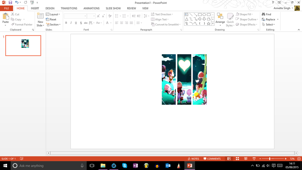
- Maybe we can use this? It's from the original chi, but I don't think that matters much. TheSilentHero 15:59, 6 September 2015 (UTC)
Logo[edit]
EDIT 13:14, 5 September 2015 (UTC): Proposed logo, based on what was the official wallpaper on the KHX website some time back. I'd like to hear your thoughts. TRSNX
EDIT 13:23, 5 September 2015 (UTC): Sorry for the multiple posts, but I've also come up with a logo in the style of our previous KHW logos (character - character - character), this time featuring Ephemera + Chirithy + Unknown. TRSNX
- Can we see the character logo? Our current logo alternates between three different logos so do we want to continue that or only have one? Personally, I think one is okay; we only done that for 2.5 because we actually had a reason to. TheFifteenthMember 17:27, 5 September 2015 (UTC)
Okay, here are both logos side-by-side for comparison:
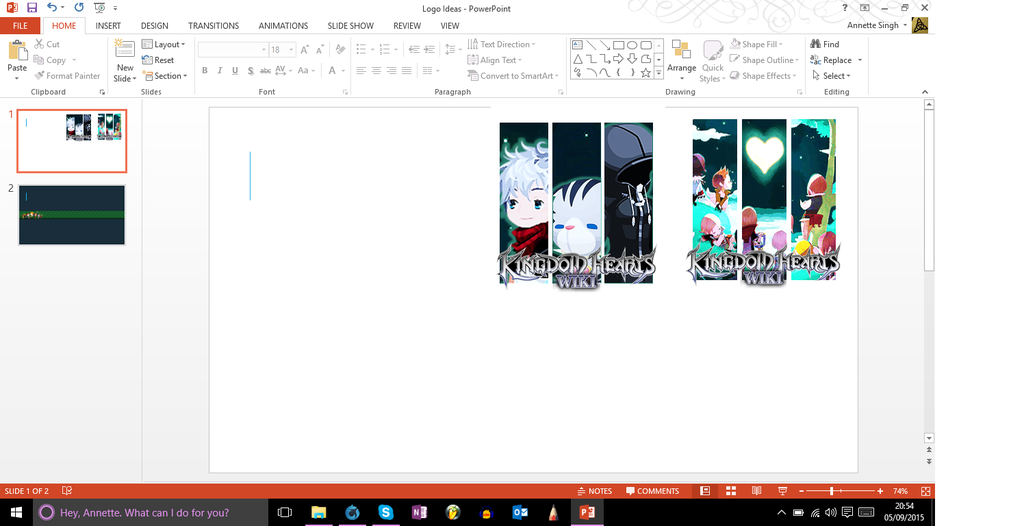
What do you folks think? While I do think the three characters one looks a bit plain, I'll go with what most people choose. TRSNX 19:56, 5 September 2015 (UTC)
- Can we make them alternate with each refresh like the one we have now? Pea14733 ---- [火] 19:58, 5 September 2015 (UTC)
It is possible to, but the one we have now has a justification: 2.5 Remix is a combination of three games. Would there really be a justification if it's just one game we're celebrating? O_O TRSNX 20:14, 5 September 2015 (UTC)
- We could choose to celebrate both x and unchained x, so we can have two logos. TheSilentHero 22:56, 5 September 2015 (UTC)
Should I start updating the images now, or should I wait until they're all done before I do anything? TRSNX 23:05, 5 September 2015 (UTC)
- Honestly, I think the character image is missing something; I would prefer the other one to be the only logo because I find it adorably pretty (my own opinion though). But if we are keeping the character logo, would it be possible to remove the tiny white lights in the background; they look a bit strange in my opinion. TheFifteenthMember 09:39, 6 September 2015 (UTC)
I'm going to regress on my opinion, seeing as that actually doesn't work too well as a logo. I'm happy to stick with just the character logo but we need to get rid of the code that causes the alternate logos (which by the way, are saved under File:Wiki 2.png and File:Wiki 3.png). I think it's in a .css file somewhere but I don't know where. TheFifteenthMember 11:21, 6 September 2015 (UTC)
- The logo has since been changed to Ephemera + Chirithy + Unknown. Not sure how well this works, but I hope it works somehow. We still know that the game is radically different... TRSNX 12:38, 6 September 2015 (UTC)
Wiki 2 and Wiki 3[edit]
Okay, what do we do about those two logos? Any suggestions? TRSNX 16:46, 7 September 2015 (UTC)
- If we're going to have only one logo, I would suggest either removing the coding that randomizes the logos, or upload the same logo we have now as Wiki 2 and Wiki 3 as well. TheSilentHero 16:56, 7 September 2015 (UTC)
Trouble is, I'm not quite sure where the coding for this is... TRSNX 17:17, 7 September 2015 (UTC)
- It's in Mediawiki:Common.js TheSilentHero 17:20, 7 September 2015 (UTC)
Headers[edit]
I would like the header to be based off this, somehow:

13:33, 5 September 2015 (UTC)
Alright, I've come up with a header design, based on that image I sought after earlier. Here's what it looks like.

Now granted, the BG is that of Dream Drop Distance, but Chirithy are Dream Eaters. If you recommend that I use another BG altogether, please let me know. TRSNX 14:11, 5 September 2015 (UTC)
- You could derive the BG from the website, which uses heart, Keyblade and Lux symbols. TheFifteenthMember 17:27, 5 September 2015 (UTC)
- The backgrounds on these wallpapers are more detailed. --ShardofTruth 19:18, 5 September 2015 (UTC)
Thanks, folks. Working on it ASAP. TRSNX 19:56, 5 September 2015 (UTC)
- EDIT 20:11, 5 September 2015 (UTC): Thanks for your recommendations; here is a second header idea. TRSNX

- Feedback on this: Header is fuzzy on RB and Vector. Probably because original file is very small and it's blown up to the point where quality is reduced. (ps use imgur ;D) The links in the corner of Vector are not very visible with the clash of the deep teal of header vs light blue of links.
 ANX219 01:36, 6 September 2015 (UTC)
- Hello everyone! I have no idea what any of you are talking but if you happen to need any help with the images TNE let me know and I'll do my best to help you around! Got photoshop and SAI on my side should you need any of their features for anything :) I'm in uni tho so times are limited to weekends :/
 Draaek the Blazing Dragon of Light 02:03, 6 September 2015 (UTC)
Draaek, if you could help me tidy up the Roundedblue and Vector headers, I'll be grateful. Right now they look pixellated, their quality has been reduced because I attempted to scale them up. ANX, you too. I did this up till 01:00 last night and I won't be able to handle this until I return from Mass this morning/afternoon. TRSNX 06:39, 6 September 2015 (UTC)
I think the header's design is fine but with the smoothing and low contrast it looks really blurry now. Also there seems to be something wrong with the pattern, so I extraced the repeated unit that can be exteneded in every direction. It's not really perfect either but that's the original designer's fault. --ShardofTruth 13:39, 6 September 2015 (UTC)

Roundedblue Header Issues[edit]
ANX and Draaek, I don't know if either of you have updated the Roundedblue header -- but it still seems fuzzy to me. Is it just me, or do you two have the same problem? TRSNX 16:47, 7 September 2015 (UTC)
- By fuzzy do you mean super blurry? The header wasn't updated but it looks like it was upscaled very badly. I've tried a different approach, but it's a bit plain. --ShardofTruth 21:14, 8 September 2015 (UTC):

- Solved. It turns out that the file Draaek sent me had not been uploaded yet, and I took to uploading what she sent me over Skype call. (Yes, she did it up and cleared it all up.) TRSNX 21:28, 8 September 2015 (UTC)
Seriously, though, thank Draaek. She was the one who made it un-blurry, and it's her version of the header that we are using. TRSNX 21:45, 8 September 2015 (UTC)
- Haha no problem at all! In fact, I'm glad I can help out the wiki just a tiny bit more considering I don't really do anything here xD Draaek the Blazing Dragon of Light 21:50, 8 September 2015 (UTC)
Colours[edit]
|
|
| |||||||||||||||||||||||||||||||||||||||||||||||||||||||||||||||||||||||||||||||||||||||||||||||||||||||||||||||||||||||||||||||||||||||||||||||||||||||||||||||||||||||||||||||||||||||||||||||||||||||||||||||||||||||||||||||||||||||||||||||||||||||||||||||||||||||||||||||||||||||||||||||||||||||
CSS Troubles[edit]

|
| |||||||||||||||||||||||||||||||||||||||||||||||||||||||||||||||||||||||||||||||||||||||||||||||||||||||||||||||||||||||||||||||||||||||||||||||||||||||||||||||||||||||||||||||||||||||||||||||||||||||||||||||||||||||||||||||||||||||||||||||||||||||||||||||||||||||||||||||||||||||||||||||||||||||
|
|
| |||||||||||||||||||||||||||||||||||||||||||||||||||||||||||||||||||||||||||||||||||||||||||||||||||||||||||||||||||||||||||||||||||||||||||||||||||||||||||||||||||||||||||||||||||||||||||||||||||||||||||||||||||||||||||||||||||||||||||||||||||||||||||||||||||||||||||||||||||||||||||||||||||||||||||||||||||||||||||||||||||||||
An attempt at the CSS: http://www.khwiki.com/User:Troisnyxetienne/roundedblue.css
Feel free to play around with colours and find out which is best for you all. It's probably not as complete and there are some bits missing, but I hope it turns out okay and we can agree on a colour scheme eventually.
TRSNX 20:45, 6 September 2015 (UTC)
Progress with the CSS[edit]
Has anyone given it a shot yet, and played around with the colours? What do you all think? TRSNX 21:47, 8 September 2015 (UTC)
Spinny Search GIF[edit]
I spent like two hours on this I hope it's ok. http://imgur.com/TXMPEa5 I'll go ahead and add it in. Any objections shall be stated now or forever hold your piece. ANX219 22:03, 6 September 2015 (UTC)