|
|
| Line 81: |
Line 81: |
|
| |
|
| {{KeybladeSpyMaster|time=03:38, 20 July 2014 (UTC)|text=Again, I already have the logo thing working, my custom JS is already working. It's switching from the four logos randomly (I'm using Logo Version 1 as well because I love that one, but I know we're not using that one in the end). So we don't have to choose just one if we don't want to. I'm surprised there's a complaint/concern about the Xehanort one, I felt that was the best of all four just on its own, without a need for a change, so it's not altered at all. I'll play around with it when I can. I've already made the welcome images just as ENX and FM have suggested, which is weird (I guess great minds really do think alike, along with mine...). I just didn't post it here because it's a simple organization of renders. I'd love to do something with the Keyblades, but I have no idea what to do.}} | | {{KeybladeSpyMaster|time=03:38, 20 July 2014 (UTC)|text=Again, I already have the logo thing working, my custom JS is already working. It's switching from the four logos randomly (I'm using Logo Version 1 as well because I love that one, but I know we're not using that one in the end). So we don't have to choose just one if we don't want to. I'm surprised there's a complaint/concern about the Xehanort one, I felt that was the best of all four just on its own, without a need for a change, so it's not altered at all. I'll play around with it when I can. I've already made the welcome images just as ENX and FM have suggested, which is weird (I guess great minds really do think alike, along with mine...). I just didn't post it here because it's a simple organization of renders. I'd love to do something with the Keyblades, but I have no idea what to do.}} |
| | :Before we implement it, is there any serious consequence to adding the logo-switching feature (e.g. significantly longer loading times)? The Xehanort is a good logo, the only problem is that the background isn't as consistent as the other logo backgrounds. {{User:TheFifteenthMember/Sig1}} 00:56, 21 July 2014 (UTC) |
Revision as of 00:56, 21 July 2014

|
|
|
|
|
|
|
|
|
|
|
|
|
|
|
|
|
|
|
|
|
|
|
|
|
|
|
|
|
|
|
|
|
|
|
|
|
|
|
|
KeybladeSpyMaster - The light'll never give up on you. You'll always find it, even in the deepest darkness! But you have to believe!
TALK -  You all did great! - 11:10 PM Thu, July 17, 2014 MDT You all did great! - 11:10 PM Thu, July 17, 2014 MDT
|
|
|
|
|
|
|
|
|
|
|
|
|
|
|
|
|
|
|
|
|
|
|
|
|
|
|
|
|
|
|
|
|
|
|
|
|
|
|
|
|
|
|
|
|
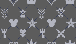
 For those of you Kingdom Hearts fans who have somehow been living under a rock long enough to not notice at all today, we now have the cover artwork for Kingdom Hearts HD 2.5 ReMIX. Guess what that means? We can now work on the wonderful new theme from the wiki! (Yay!) That momentous and joyous day for, at least some of us, has finally arrived. In fact, I've already made some ideas. However, they're still ideas, so if there's any changes we want, we can definitely discuss them here. Now, I've got some ideas on my Gadget Lab, but I made some today that deserve discussion, probably more than those. So here they are. For those of you Kingdom Hearts fans who have somehow been living under a rock long enough to not notice at all today, we now have the cover artwork for Kingdom Hearts HD 2.5 ReMIX. Guess what that means? We can now work on the wonderful new theme from the wiki! (Yay!) That momentous and joyous day for, at least some of us, has finally arrived. In fact, I've already made some ideas. However, they're still ideas, so if there's any changes we want, we can definitely discuss them here. Now, I've got some ideas on my Gadget Lab, but I made some today that deserve discussion, probably more than those. So here they are.
Background
Version 4. This one is based on the pattern in the new artwork.
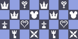
Version 3. This one I made a couple days ago, and is based off the color scheme from the logo.
Logo
Version 1. I made this a couple days ago.

Version 2. Made from the artwork

Version 3. Made from the artwork

Version 4. Made from the artwork

The wiki's new wordmark. I made it from the logo, thanks to some tips from Erry.

Now, the logos can be re-colored, the way the current logo had the backgrounds for each section re-colored in gray. We've also got an idea floating around about using all three logos from the artwork (versions 2-4), and have them change every time the page loads. I'm really close, I've got it to change, but only as the background, not the logo. So, yeah, I'm close, and I'm sure it can be done. In case we can't, I'd like to choose a logo that we might want to use. But other than that, any other changes? Any other ideas? Go! Discuss! 
|
|
|
|
|
|
|
|
|
|
|
|
|
|
|
|
|
|
|
|
|
|
|
|
|

|
|
|
|
|
|
|
|
|
|
|
|
|
|
|
|
|
|
|
|
|
|
|
|
|
|
|
|
|
|
|
|
|
|
|
|
|
|
|
|
TheFifteenthMember Yes. You're creepy. I can't say we'll miss you while you're gone, so it'd be best if you did go. We all win that way. — TheFifteenthMember 14:51, 18 July 2014 (UTC)
|
|
|
|
|
|
|
|
|
|
|
|
|
|
|
|
|
|
|
|
|
|
|
|
|
|
|
|
|
|
|
|
|
|
|
|
|
|
|
|
|
|
|
|
|
*Skin: Could we see a screenshot of version 4 in use? It's the most official skin but I'm not sure if the design will suit the Wiki.
- Logo: In order from most to least, I like V2 > V3 > V4 > V1. All of them needs to have the same background colour in each panel though, either black, white or blue. If we manage to have the alternating logo, I think we should use V2, 3 and 4. If we're limited to one, I back V2.
- Wordmark: Can't we keep it the same?
And thanks KSM for heading the KHWiki theme update yet again!
|
|
|
|
|
|
|
|
|
|
|
|
|
|
|
|
|
|
|
|
|
|
|
|
|
|
|
|
|
|
|
|
|
|
|
|
|

|
|
|
|
|
|
|
|
|
|
|
|
|
|
|
|
|
|
|
|
|
|
|
|
|
|
|
|
|
|
|
|
|
|
|
|
|
|
|
|
KeybladeSpyMaster - I do it for my family, my home, my friends! I do it for her!
TALK -  Welcome to Spy Force One. - 10:23 AM Fri, July 18, 2014 MDT Welcome to Spy Force One. - 10:23 AM Fri, July 18, 2014 MDT
|
|
|
|
|
|
|
|
|
|
|
|
|
|
|
|
|
|
|
|
|
|
|
|
|
|
|
|
|
|
|
|
|
|
|
|
|
|
|
|
|
|
|
|
|
 I'll address your concerns. First, the screenshot, which is here. Second, the alternating logo works, I just got it to work five minutes ago. Concerning the logo background, yeah, I'll change it. I think it'd best in dark blue, like how Logo ver. 2 is. However, what if we made them all different colors? Like, ver. 2 can be dark blue, Ver. 3 can be light blue, and ver. 4 can be black. Or something of the like. All the sections would be the same color, the color would only change with the logo. It's just an idea. As for the wordmark, I believe we always change it to whatever is currently on the logo. In the KH3D logo, it was the pink-magenta wordmark in the logo. With the current theme, it's the black-gray logo in the wiki's current logo. Since the new logos use a gray-blue logo from the KHHD 2.5 logo, the wordmark should also reflect that. Unless you want to simply recolor the current wordmark in gray-blue and use that in the logos as well. I'll address your concerns. First, the screenshot, which is here. Second, the alternating logo works, I just got it to work five minutes ago. Concerning the logo background, yeah, I'll change it. I think it'd best in dark blue, like how Logo ver. 2 is. However, what if we made them all different colors? Like, ver. 2 can be dark blue, Ver. 3 can be light blue, and ver. 4 can be black. Or something of the like. All the sections would be the same color, the color would only change with the logo. It's just an idea. As for the wordmark, I believe we always change it to whatever is currently on the logo. In the KH3D logo, it was the pink-magenta wordmark in the logo. With the current theme, it's the black-gray logo in the wiki's current logo. Since the new logos use a gray-blue logo from the KHHD 2.5 logo, the wordmark should also reflect that. Unless you want to simply recolor the current wordmark in gray-blue and use that in the logos as well.
I'm really excited to finally be able to spearhead this again, I've been waiting for this for months, seriously. 
|
|
|
|
|
|
|
|
|
|
|
|
|
|
|
|
|
|
|
|
|
|
|
|
|

|
|
|
|
|
|
|
|
|
|
|
|
|
|
|
|
|
|
|
|
|
|
|
|
|
|
|
|
|
|
|
|
|
|
|
|
|
|
|
|
KeybladeSpyMaster - I do it for my family, my home, my friends! I do it for her!
TALK -  Welcome to Spy Force One. - 02:54 PM Fri, July 18, 2014 MDT Welcome to Spy Force One. - 02:54 PM Fri, July 18, 2014 MDT
|
|
|
|
|
|
|
|
|
|
|
|
|
|
|
|
|
|
|
|
|
|
|
|
|
|
|
|
|
|
|
|
|
|
|
|
|
|
|
|
|
|
|
|
|
 Ok, here's the logos recolored a bit. Ok, here's the logos recolored a bit.
Version 5

Version 6

I left the Xehanort-Ansem-Xemnas logo alone, I felt that was okay already.
And the cleaner wordmark. I hadn't noticed how un-clean and un-finished the wordmark was before I posted it here.

EDIT: And here's the sidebar decoration

And another screenshot is here 
|
|
|
|
|
|
|
|
|
|
|
|
|
|
|
|
|
|
|
|
|
|
|
|
|
- I like where this is going. FM's comments are pretty much my same thoughts/comments/concerns. Nice job so far, guys. Xion4ever 02:50, 19 July 2014 (UTC) EDIT: Oh, I forgot about this...I say we go with a grey background or dark color. While blue is one of my favorite colors, the blue Wiki background and the blue background on the logos? Eh...I'm not so much a fan. Xion4ever 02:52, 19 July 2014 (UTC)
- Does anyone have a screenshot of the Wiki's theme in the BBS era? I'd like to see how we made the blue work then. TheFifteenthMember 14:36, 19 July 2014 (UTC)
- Click Xion4ever 17:12, 19 July 2014 (UTC)
- It appears we used the official pattern from Birth by Sleep then, and it was a white and really-light gray checkered pattern. See here. Here is a screenshot with Logo 2 right here. I personally feel we could make it work, and that it wouldn't look so bad. I've been using the new theme for the last two days, and the only problem I feel could exist is the fact that the Terra-Ventus-Aqua Logo does have a background similar to the pattern, which could easily be fixed. Other than that, I don't find too much a problem with the blues.
 KeybladeSpyMaster
  17:33, 19 July 2014 (UTC)

|
|
|
|
|
|
|
|
|
|
|
|
|
|
|
|
|
|
|
|
|
|
|
|
|
|
|
|
|
|
|
|
|
|
|
|
|
|
|
|
Eternal Nothingness XIII -  You have to be strong. Strength of heart will carry you through the hardest of trials. You have to be strong. Strength of heart will carry you through the hardest of trials.
TALK - What I do, I do for friendship. — 19:48, 19 July 2014 (UTC)
|
|
|
|
|
|
|
|
|
|
|
|
|
|
|
|
|
|
|
|
|
|
|
|
|
|
|
|
|
|
|
|
|
|
|
|
|
|
|
|
|
|
|
|
|
 I still really like the "sidebar decorations"/background pattern, KSM. As for the logo, unless you can find a way for the coding to allow an "option/choose" thing like you were talking about on the IRC, I think we should just take the most important characters from each "game" in the cover art and just use them. Master Xehanort obviously has prominence in the artwork, so I think he should go in the middle. But then on either side of him could be Sora, and perhaps Ventus (unless we find Aqua or Terra more worthy of a candidate to represent Birth by Sleep... Keyblades also have a lot of prominence in the cover art...maybe we should do something on here with those? Decorate the main page with them, that sort of thing? We can always change the images of Sora, Riku, and Kairi and Axel, Roxas, and Xion to images of Sora, Donald, and Goofy and Terra, Ventus, and Aqua, as well. I still really like the "sidebar decorations"/background pattern, KSM. As for the logo, unless you can find a way for the coding to allow an "option/choose" thing like you were talking about on the IRC, I think we should just take the most important characters from each "game" in the cover art and just use them. Master Xehanort obviously has prominence in the artwork, so I think he should go in the middle. But then on either side of him could be Sora, and perhaps Ventus (unless we find Aqua or Terra more worthy of a candidate to represent Birth by Sleep... Keyblades also have a lot of prominence in the cover art...maybe we should do something on here with those? Decorate the main page with them, that sort of thing? We can always change the images of Sora, Riku, and Kairi and Axel, Roxas, and Xion to images of Sora, Donald, and Goofy and Terra, Ventus, and Aqua, as well.
|
|
|
|
|
|
|
|
|
|
|
|
|
|
|
|
|
|
|
|
|
|
|
|
|
The Xehanort logo's background still needs a brush up; Xehanort's middle panel has a much darker shade of blue than the other two panels, which is somewhat distracting. Also, perhaps the background's opacity should be decreased or the colours be made fainter so that the background isn't so prominent and "jolting" (not sure how else to word it)? If we are confined to one logo, I think we should stick with the Xehanort logo (Xehanort, Ansem and Xemnas) as they're largely representative of the Xehanort saga as a whole. Seeing as 2.5 is the last HD remaster of the saga and it prepares for KH3 -the climax of the saga-, the Xehanort logo is most fitting. Besides, using Xehanort is more original than using Sora, Riku, Kairi, Donald, Goofy Ventus, Terra or Aqua, because they've all been overused in our logos already :P. To represent BBS, KH2 and Re:coded, the main page can have the ideas ENX suggested with Sora, Donald, Goofy and Ventus, Terra, Aqua going on the main page. TheFifteenthMember 23:59, 19 July 2014 (UTC)

|
|
|
|
|
|
|
|
|
|
|
|
|
|
|
|
|
|
|
|
|
|
|
|
|
|
|
|
|
|
|
|
|
|
|
|
|
|
|
|
KeybladeSpyMaster - I do it for my family, my home, my friends! I do it for her!
TALK -  Welcome to Spy Force One. - 09:38 PM Sat, July 19, 2014 MDT Welcome to Spy Force One. - 09:38 PM Sat, July 19, 2014 MDT
|
|
|
|
|
|
|
|
|
|
|
|
|
|
|
|
|
|
|
|
|
|
|
|
|
|
|
|
|
|
|
|
|
|
|
|
|
|
|
|
|
|
|
|
|
 Again, I already have the logo thing working, my custom JS is already working. It's switching from the four logos randomly (I'm using Logo Version 1 as well because I love that one, but I know we're not using that one in the end). So we don't have to choose just one if we don't want to. I'm surprised there's a complaint/concern about the Xehanort one, I felt that was the best of all four just on its own, without a need for a change, so it's not altered at all. I'll play around with it when I can. I've already made the welcome images just as ENX and FM have suggested, which is weird (I guess great minds really do think alike, along with mine...). I just didn't post it here because it's a simple organization of renders. I'd love to do something with the Keyblades, but I have no idea what to do. Again, I already have the logo thing working, my custom JS is already working. It's switching from the four logos randomly (I'm using Logo Version 1 as well because I love that one, but I know we're not using that one in the end). So we don't have to choose just one if we don't want to. I'm surprised there's a complaint/concern about the Xehanort one, I felt that was the best of all four just on its own, without a need for a change, so it's not altered at all. I'll play around with it when I can. I've already made the welcome images just as ENX and FM have suggested, which is weird (I guess great minds really do think alike, along with mine...). I just didn't post it here because it's a simple organization of renders. I'd love to do something with the Keyblades, but I have no idea what to do. 
|
|
|
|
|
|
|
|
|
|
|
|
|
|
|
|
|
|
|
|
|
|
|
|
|
- Before we implement it, is there any serious consequence to adding the logo-switching feature (e.g. significantly longer loading times)? The Xehanort is a good logo, the only problem is that the background isn't as consistent as the other logo backgrounds. TheFifteenthMember 00:56, 21 July 2014 (UTC)


 KeybladeSpyMaster
  17:33, 19 July 2014 (UTC)


 Welcome to Spy Force One. - 10:23 AM Fri, July 18, 2014 MDT


