From the Kingdom Hearts Wiki, the Kingdom Hearts encyclopedia
Jump to navigationJump to search
|
|
| Line 50: |
Line 50: |
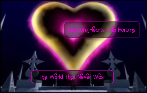
| If I must, I'll redo the TWTNW forum image, but I'll work on Twilight Town first, since finding images is the most taxing part. | | If I must, I'll redo the TWTNW forum image, but I'll work on Twilight Town first, since finding images is the most taxing part. |
|
| |
|
| EDIT 02:41, February 13, 2010 (UTC) : I redid the TWTNW image, I'm going to put it up, please don't edit conflict for the next 5mn.}} | | EDIT 02:41, February 13, 2010 (UTC) : I redid the TWTNW image, I'm going to put it up, please don't edit conflict for the next 5mn. |
| | |
| | EDIT 02:43, February 13, 2010 (UTC) : Here it is ! Flower tattoos removed, and the Organisation members are zoomed out. |
| | |
| | http://i251.photobucket.com/albums/gg299/TroisNyxEtienne/TWTNW2.png}} |
Revision as of 02:43, 13 February 2010

|
|
|
|
|
|
|
|
|
|
|
|
|
|
|
|
|
|
|
|
|
|
|
|
|
|
|
|
|
|
|
|
|
|
|
|
|
|
|
|
KrytenKoro - And when you see me standing there, you'll know you've got a friend with a rock, I mean a big-ass rock.
TALK -
|
|
|
|
|
|
|
|
|
|
|
|
|
|
|
|
|
|
|
|
|
|
|
|
|
|
|
|
|
|
|
|
|
|
|
|
|
|
|
|
|
|
|
|
|
I'm actually against this. I love how the forum still uses the older games, and in an original way that isn't straight from the games.
If I could suggest instead, keep the current graphic for the TWTNW forums, and create a Twilight Town version for the TT forums?
|
|
|
|
|
|
|
|
|
|
|
|
|
|
|
|
|
|
|
|
|
|
|
|
|

|
|
|
|
|
|
|
|
|
|
|
|
|
|
|
|
|
|
|
|
|
|
|
|
|
|
|
|
|
|
|
|
|
|
|
|
|
|
|
|
~Soralover101~ - "A scattered dream is like a far-off memory, a far-off memory is like a scattered dream."
TALK - I wanna line the pieces up. Yours and mine.
|
|
|
|
|
|
|
|
|
|
|
|
|
|
|
|
|
|
|
|
|
|
|
|
|
|
|
|
|
|
|
|
|
|
|
|
|
|
|
|
|
|
|
|
|
You know, this is pretty sick (the good sick not the bad sick)!!! I love the Twilight Town one!!
|
|
|
|
|
|
|
|
|
|
|
|
|
|
|
|
|
|
|
|
|
|
|
|
|

|
|
|
|
|
|
|
|
|
|
|
|
|
|
|
|
|
|
|
|
|
|
|
|
|
|
|
|
|
|
|
|
|
|
|
Guardian Soul Talk. — Don't I even warrant a hello? It's such a shame. The Organization used to be the rope that bound us together. - 22:36, October 11, 2009 (UTC)
|
|
|
|
|
|
|
|
|
|
|
|
|
|
|
|
|
|
|
|
|
|
|
|
|
|
|
|
|
|
|
|
|
|
|
|
|
|
|
|
|
|
|
|
|
|
|
|
|
|
|
|
|
|
|
|
|
|
|
|
|
|
|
|
|
|
|
|
|
 Sorry, but I agree with Kryen. These are just pieces of game art with words slapped on them. Sorry, but I agree with Kryen. These are just pieces of game art with words slapped on them.
|
|
|
|
|
|
|
|
|
|
|
|
|
|
|
|
|
|
|
|
|
|
|
|
|
|
|
|
|
|
|
|
|
|

|
|
|
|
|
|
|
|
|
|
|
|
|
|
|
|
|
|
|
|
|
|
|
|
|
|
|
|
|
|
|
|
|
|
|
|
|
|
|
|
BebopKate - This one is Zazzles...because he's Zazzy!
TALK - Here's your cat...and here's your $20...00:03, October 12, 2009 (UTC)
|
|
|
|
|
|
|
|
|
|
|
|
|
|
|
|
|
|
|
|
|
|
|
|
|
|
|
|
|
|
|
|
|
|
|
|
|
|
|
|
|
|
|
|
|
I like your choice of artwork, DTN, but they are a little hard to read since there's just so much going on in them, even with the black fade.
If I may be so bold as to make a suggestion? As I mentioned in the other forum thread, I'm working on cleaning up several of the Kingdom Hearts Mobile sprites to eventually make into awesome talk bubble icons catalog on the wiki. Would you guys like me to make new headers using these? And if so, I could use some suggestions of what to actually do with the little buggers, so any ideas would be great if that's the case.
|
|
|
|
|
|
|
|
|
|
|
|
|
|
|
|
|
|
|
|
|
|
|
|
|

|
|
|
|
|
|
|
|
|
|
|
|
|
|
|
|
|
|
|
|
|
|
|
|
|
|
|
|
|
|
|
|
|
|
|
|
|
|
|
|
Yer mom - SOMOS HOMBRES O PAYASOS!!!!
TALK - 18:21, October 12, 2009 (UTC)
|
|
|
|
|
|
|
|
|
|
|
|
|
|
|
|
|
|
|
|
|
|
|
|
|
|
|
|
|
|
|
|
|
|
|
|
|
|
|
|
|
|
|
|
|
Yeah those images look kinda... plain and not too artsy. I like the one we have actually, maybe we can just modify it so instead of the forums text it reads "The World that Never Was" and "Twilight Town Library" but keeping the same images? Besides, COM sprites are love ^^
|
|
|
|
|
|
|
|
|
|
|
|
|
|
|
|
|
|
|
|
|
|
|
|
|

|
|
|
|
|
|
|
|
|
|
|
|
|
|
|
|
|
|
|
|
|
|
|
|
|
|
|
|
|
|
|
|
|
|
| Bluer says at 14:15, February 10, 2010 (UTC)
|
|
|
|
|
|
|
|
|
|
|
|
|
|
|
|
|
|
|
|
|
|
|
|
|
|
|
|
|
|
|
|
|
|
|
|
|
|
|
|
|
|
|
|
|
|
|
|
|
|
|
|
|
|
|
|
|
|
|
|
|
|
|
|
|
|
|
|
| Oh, no, kupo! That new forum image looks a bit too out of proportion, kupo. If it's gonna replace the old one, it has to have some zest in it without actually trying, kupo!
Actually, I'd say it's an effort, but it's not really.. satisfying,
|
|
|
|
|
|
|
|
|
|
|
|
|
|
|
|
|
|
|
|
|
|
|
|
|
|
|
|
|
|
|
|
|
|

|
|
|
|
|
|
|
|
|
|
|
|
|
|
|
|
|
|
|
|
|
|
|
|
|
|
|
|
|
|
|
|
|
|
|
|
|
|
|
|
 I have a different idea, which I'll be bringing up in the IRC. I have a different idea, which I'll be bringing up in the IRC.
EDIT 14:36, February 10, 2010 (UTC) : See this :
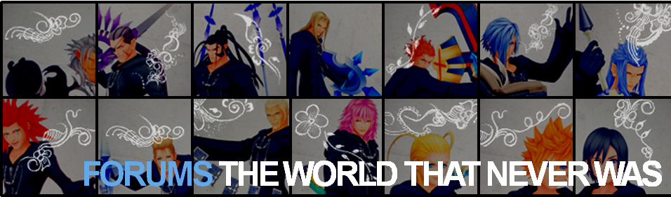
Sized this at 960-something pixels, but I think this'll do for TWTNW. I plan to use the same idea for Twilight Town, except that we replace the OXIII with Twilight Town characters amidst the orange Twilight Town backdrop, with orange undertones. What do you think ?
|
|
|
|
|
|
|
|
|
|
|
|
|
|
|
|
|
|
|
|
|
|
|
|
|
|
|
|
|
|
|
|
|
|
|
|
|
|
|
|
|
|
|
|
|
Helping others always comes before asking others for help. • TroisNyxÉtienne — 14:17, February 10, 2010 (UTC)
|
|
|
|
|
|
|
|
|
|
|
|
|
|
|
|
|
|
|
|
|
|
|
|
|

|
|
|
|
|
|
|
|
|
|
|
|
|
|
|
|
|
|
|
|
|
|
|
|
|
|
|
|
|
|
|
|
|
|
|
|
|
|
|
|
 Ooo nice picture, TNE. Sounds like a plan, no objections here. ^^ Ooo nice picture, TNE. Sounds like a plan, no objections here. ^^
|
|
|
|
|
|
|
|
|
|
|
|
|
|
|
|
|
|
|
|
|
|
|
|
|
|
|
|
|
|
|
|
|
|
|
|
|
|
|
|
|
|
|
|
|
Xion4ever Who am I? — 20:18, February 11, 2010 (UTC)
|
|
|
|
|
|
|
|
|
|
|
|
|
|
|
|
|
|
|
|
|
|
|
|
|
|
|
|
|
|
|
|
|
|
|
|
|
|
|
|
|
|
|
|
|
|
|
|
|
|
|
|
|
|
|
|
|
|
|
|
|
|
|
|
|
|
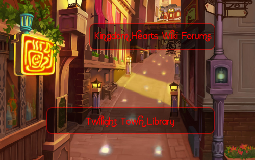
I know that making the sign for Twilight Town Library is going to be a bit hard. For starters, I only have one square (HPO eating sea-salt ice-cream, and I have to get a lot more printscreens of people with different expressions from Twilight Town). But thanks anyway. ^_^
|
|
|
|
|
|
|
|
|
|
|
|
|
|
|
|
|
|
|
|
|
|
|
|
|
|
|
|
|
|
|
|
|
|
|
|
|
|
|
|
|
|
|
|
|
Helping others always comes before asking others for help. • TroisNyxÉtienne — 00:52, February 12, 2010 (UTC)
|
|
|
|
|
|
|
|
|
|
|
|
|
|
|
|
|
|
|
|
|
|
|
|
|
|
|
|
|
|
|
|
|
|
|
|
|
|
|
|
|
|
|
|
|
|
|
|
|
|
|
|
|
|
|
|
|
|
|
|
|
|
|
|
|
|
BebopKate - This one is Zazzles...because he's Zazzy!
TALK - Here's your cat...and here's your $20...20:14, February 12, 2010 (UTC)
|
|
|
|
|
|
|
|
|
|
|
|
|
|
|
|
|
|
|
|
|
|
|
|
|
|
|
|
|
|
|
|
|
|
|
|
|
|
|
|
|
|
|
|
|
Wow, that looks nice! My only suggestion might be to push up Demyx, Larxene, Roxas, and Xion's pics a bit so they aren't hidden by the forum text.
|
|
|
|
|
|
|
|
|
|
|
|
|
|
|
|
|
|
|
|
|
|
|
|
|

|
|
|
|
|
|
|
|
|
|
|
|
|
|
|
|
|
|
|
|
|
|
|
|
|
|
|
|
|
|
|
|
|
|
|
|
|
|
|
|
Nitrous X Talk! — "Surely you must've known that this was going to happen." Want to see him? But...can you face him?
|
|
|
|
|
|
|
|
|
|
|
|
|
|
|
|
|
|
|
|
|
|
|
|
|
|
|
|
|
|
|
|
|
|
|
|
|
|
|
|
|
|
|
|
|
I'm all for TNE's, it looks fantastic! I agree with BebopKate as well. For Twilight Town, are you going to use the residents in it as well? I think that'd look cool.
|
|
|
|
|
|
|
|
|
|
|
|
|
|
|
|
|
|
|
|
|
|
|
|
|
|
|
|
|
|
|
|
|
|
|
|
|
|
|
|
|
|
|
|
|
|
|
|
|
|
|
|
|
|
|
|
|
|
|
|
|
|
|
|
|
|
Nitrous X Talk! — Then I shall make you see...That your hopes are nothing. Nothing but a mere illusion! Don't I even warrant a hello, Lexaeus?
|
|
|
|
|
|
|
|
|
|
|
|
|
|
|
|
|
|
|
|
|
|
|
|
|
|
|
|
|
|
|
|
|
|
|
|
|
|
|
|
|
|
|
|
|
I don't think it's too girly. I've seen tons of "tough" biker dudes in my neighborhood with tatoos like that. I don't think it's too large either. It fit in this area, so it'll fit in the above area.
|
|
|
|
|
|
|
|
|
|
|
|
|
|
|
|
|
|
|
|
|
|
|
|
|
|
|
|
|
|
|
|
|
|
|
|
|
|
|
|
|
|
|
|
|
|
|
|
|
|
|
|
|
|
|
|
|
|
|
|
|
|
|
|
|
|
For Twilight Town Library ? Er, I was hoping it to resemble Twilight Town a lot more.
If I must, I'll redo the TWTNW forum image, but I'll work on Twilight Town first, since finding images is the most taxing part.
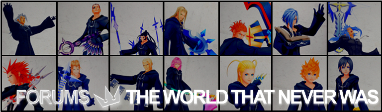
EDIT 02:41, February 13, 2010 (UTC) : I redid the TWTNW image, I'm going to put it up, please don't edit conflict for the next 5mn.
EDIT 02:43, February 13, 2010 (UTC) : Here it is ! Flower tattoos removed, and the Organisation members are zoomed out.
|
|
|
|
|
|
|
|
|
|
|
|
|
|
|
|
|
|
|
|
|
|
|
|
|
|
|
|
|
|
|
|
|
|
|
|
|
|
|
|
|
|
|
|
|
Helping others always comes before asking others for help. • TroisNyxÉtienne — 02:30, February 13, 2010 (UTC)
|
|
|
|
|
|
|
|
|
|
|
|
|
|
|
|
|
|
|
|
|
|
|
|
|