From the Kingdom Hearts Wiki, the Kingdom Hearts encyclopedia
Jump to navigationJump to search
|
|
| Line 44: |
Line 44: |
| *'''Wordmark''': Can't we keep it the same? | | *'''Wordmark''': Can't we keep it the same? |
| And thanks KSM for heading the KHWiki theme update yet again!}} | | And thanks KSM for heading the KHWiki theme update yet again!}} |
| | |
| | {{KeybladeSpyMaster|time=16:23, 18 July 2014 (UTC)|text=I'll address your concerns. First, the screenshot, which is [http://1drv.ms/1yCfOcx <font color=#FFFFFF>here</font>]. Second, the alternating logo works, I just got it to work five minutes ago. Concerning the logo background, yeah, I'll change it. I think it'd best in dark blue, like how Logo ver. 2 is. However, what if we made them all different colors? Like, ver. 2 can be dark blue, Ver. 3 can be light blue, and ver. 4 can be black. Or something of the like. All the sections would be the same color, the color would only change with the logo. It's just an idea. As for the wordmark, I believe we always change it to whatever is currently on the logo. In the KH3D logo, it was the pink-magenta wordmark in the logo. With the current theme, it's the black-gray logo in the wiki's current logo. Since the new logos use a gray-blue logo from the KHHD 2.5 logo, the wordmark should also reflect that. Unless you want to simply recolor the current wordmark in gray-blue and use that in the logos as well. |
| | |
| | I'm really excited to finally be able to spearhead this again, I've been waiting for this for months, seriously.}} |
Revision as of 16:23, 18 July 2014

|
|
|
|
|
|
|
|
|
|
|
|
|
|
|
|
|
|
|
|
|
|
|
|
|
|
|
|
|
|
|
|
|
|
|
|
|
|
|
|
KeybladeSpyMaster - The light'll never give up on you. You'll always find it, even in the deepest darkness! But you have to believe!
TALK -  You all did great! - 11:10 PM Thu, July 17, 2014 MDT You all did great! - 11:10 PM Thu, July 17, 2014 MDT
|
|
|
|
|
|
|
|
|
|
|
|
|
|
|
|
|
|
|
|
|
|
|
|
|
|
|
|
|
|
|
|
|
|
|
|
|
|
|
|
|
|
|
|
|
 For those of you Kingdom Hearts fans who have somehow been living under a rock long enough to not notice at all today, we now have the cover artwork for Kingdom Hearts HD 2.5 ReMIX. Guess what that means? We can now work on the wonderful new theme from the wiki! (Yay!) That momentous and joyous day for, at least some of us, has finally arrived. In fact, I've already made some ideas. However, they're still ideas, so if there's any changes we want, we can definitely discuss them here. Now, I've got some ideas on my Gadget Lab, but I made some today that deserve discussion, probably more than those. So here they are. For those of you Kingdom Hearts fans who have somehow been living under a rock long enough to not notice at all today, we now have the cover artwork for Kingdom Hearts HD 2.5 ReMIX. Guess what that means? We can now work on the wonderful new theme from the wiki! (Yay!) That momentous and joyous day for, at least some of us, has finally arrived. In fact, I've already made some ideas. However, they're still ideas, so if there's any changes we want, we can definitely discuss them here. Now, I've got some ideas on my Gadget Lab, but I made some today that deserve discussion, probably more than those. So here they are.
Background
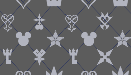
Version 4. This one is based on the pattern in the new artwork.

Version 3. This one I made a couple days ago, and is based off the color scheme from the logo.
Logo
Version 1. I made this a couple days ago.

Version 2. Made from the artwork

Version 3. Made from the artwork

Version 4. Made from the artwork

The wiki's new wordmark. I made it from the logo, thanks to some tips from Erry.

Now, the logos can be re-colored, the way the current logo had the backgrounds for each section re-colored in gray. We've also got an idea floating around about using all three logos from the artwork (versions 2-4), and have them change every time the page loads. I'm really close, I've got it to change, but only as the background, not the logo. So, yeah, I'm close, and I'm sure it can be done. In case we can't, I'd like to choose a logo that we might want to use. But other than that, any other changes? Any other ideas? Go! Discuss!
|
|
|
|
|
|
|
|
|
|
|
|
|
|
|
|
|
|
|
|
|
|
|
|
|

|
|
|
|
|
|
|
|
|
|
|
|
|
|
|
|
|
|
|
|
|
|
|
|
|
|
|
|
|
|
|
|
|
|
|
|
|
|
|
|
TheFifteenthMember Yes. You're creepy. I can't say we'll miss you while you're gone, so it'd be best if you did go. We all win that way. — TheFifteenthMember 14:51, 18 July 2014 (UTC)
|
|
|
|
|
|
|
|
|
|
|
|
|
|
|
|
|
|
|
|
|
|
|
|
|
|
|
|
|
|
|
|
|
|
|
|
|
|
|
|
|
|
|
|
|
*Skin: Could we see a screenshot of version 4 in use? It's the most official skin but I'm not sure if the design will suit the Wiki.
- Logo: In order from most to least, I like V2 > V3 > V4 > V1. All of them needs to have the same background colour in each panel though, either black, white or blue. If we manage to have the alternating logo, I think we should use V2, 3 and 4. If we're limited to one, I back V2.
- Wordmark: Can't we keep it the same?
And thanks KSM for heading the KHWiki theme update yet again!
|
|
|
|
|
|
|
|
|
|
|
|
|
|
|
|
|
|
|
|
|
|
|
|
|
|
|
|
|
|
|
|
|
|
|
|
|

|
|
|
|
|
|
|
|
|
|
|
|
|
|
|
|
|
|
|
|
|
|
|
|
|
|
|
|
|
|
|
|
|
|
|
|
|
|
|
|
KeybladeSpyMaster - I do it for my family, my home, my friends! I do it for her!
TALK -  Welcome to Spy Force One. - 10:23 AM Fri, July 18, 2014 MDT Welcome to Spy Force One. - 10:23 AM Fri, July 18, 2014 MDT
|
|
|
|
|
|
|
|
|
|
|
|
|
|
|
|
|
|
|
|
|
|
|
|
|
|
|
|
|
|
|
|
|
|
|
|
|
|
|
|
|
|
|
|
|
I'll address your concerns. First, the screenshot, which is here. Second, the alternating logo works, I just got it to work five minutes ago. Concerning the logo background, yeah, I'll change it. I think it'd best in dark blue, like how Logo ver. 2 is. However, what if we made them all different colors? Like, ver. 2 can be dark blue, Ver. 3 can be light blue, and ver. 4 can be black. Or something of the like. All the sections would be the same color, the color would only change with the logo. It's just an idea. As for the wordmark, I believe we always change it to whatever is currently on the logo. In the KH3D logo, it was the pink-magenta wordmark in the logo. With the current theme, it's the black-gray logo in the wiki's current logo. Since the new logos use a gray-blue logo from the KHHD 2.5 logo, the wordmark should also reflect that. Unless you want to simply recolor the current wordmark in gray-blue and use that in the logos as well.
I'm really excited to finally be able to spearhead this again, I've been waiting for this for months, seriously.
|
|
|
|
|
|
|
|
|
|
|
|
|
|
|
|
|
|
|
|
|
|
|
|
|